Attachments and images
A mockup, a specification, a screenshot of the bug: much of what belongs to a ticket is not a line of text. Attachments keep such files right at the ticket instead of in a chat or on a drive nobody finds later. An image can also be placed on the card itself as a card image.
Attaching files
The example is the story Order summary in QuickCart, which already has a mockup attached.
- Open the ticket and switch to the Attachments tab. The number on the tab is the count of existing attachments.
- Drag files into the dashed area Drop files here or click to upload, or click it and pick them in the file dialog. Several files at once are possible.
- While uploading it says Uploading.... Afterwards the file appears in the list.
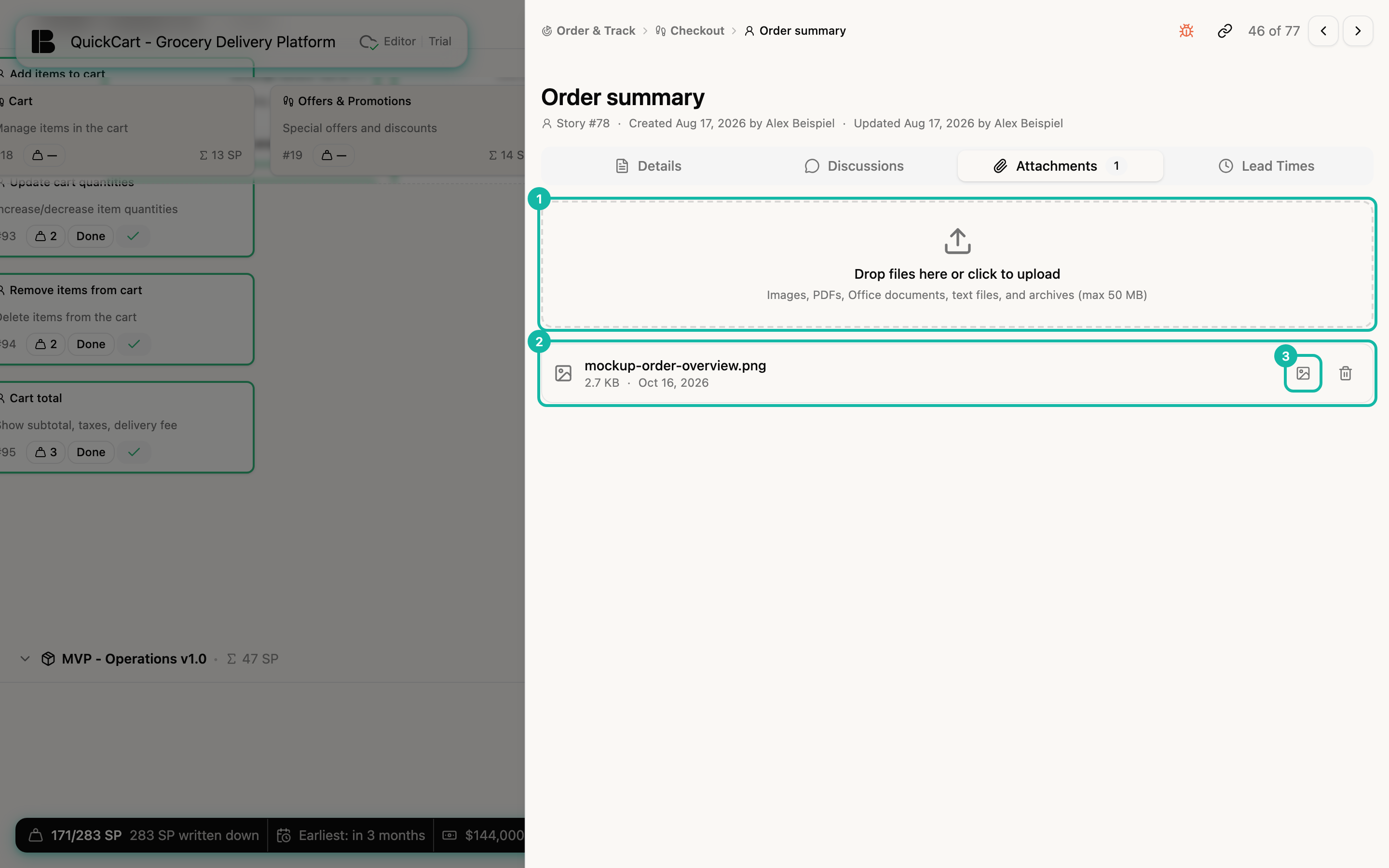
Allowed are images (JPEG, PNG, GIF, WebP), PDFs, Office documents, text files and archives up to 50 MB per file. The list shows name, size and date. Clicking the file name opens or downloads the file.
You can also attach files while writing: the paperclip in the toolbar of every comment field (see Discussions and comments) inserts a file into the comment.
Deleting an attachment
The trash icon at the right of the row deletes the attachment for good after the confirmation Delete attachment?. This cannot be undone.
Uploaded images are automatically scaled to at most 2048 × 2048 pixels and stored as JPEG; a small version is created for previews. If you need the original, keep a copy outside Betterplan as well.
Setting an image as the card image
For images, the row has an extra image icon (tooltip Set as card image). Clicking it puts the image at the top of the ticket's card.
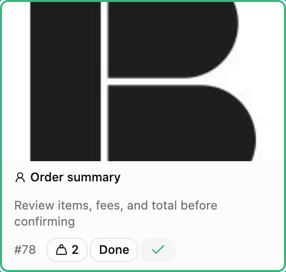
- The image appears in 16:9 at the top of the card, cropped to the centre.
- Clicking the image opens it large in the lightbox. Close it with the cross at the top right, a click next to the image, or
Esc. - A ticket has one card image. In the list, the attachment used as card image has a coloured frame; its icon now reads Remove card image and takes the image off the card, while the attachment stays.
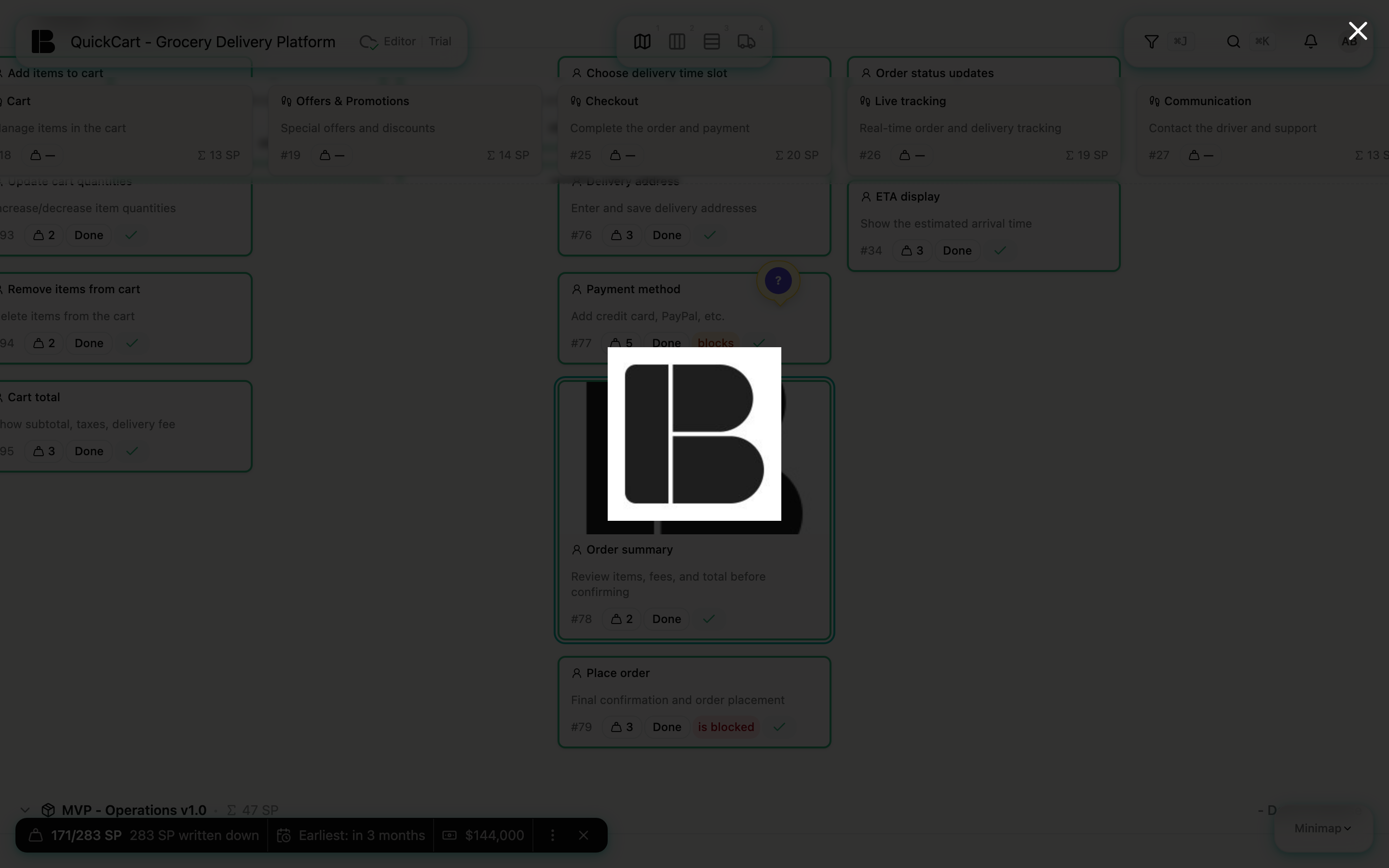
A mockup on the card makes the Storyboard and the Backlog more tangible, especially in conversations with stakeholders who don't want to read ticket texts.
Permissions
Anyone who can only read, for example a guest with a share link of level Read-only or Commenter, sees the attachments and can open them, but cannot upload or delete files or set a card image. See Involving stakeholders.